This exercise consists of some old photographs and some taken specifically for the exercise.
The first three are images lighter than normal. The snow scene was taken opening up one stop to make the snow appear white. The Greenbottle was a flash photo with no exposure compensation, but the cameras metering seems to have coped well. The swan shot again was given one stop over exposure to whiten the snow and the birds.
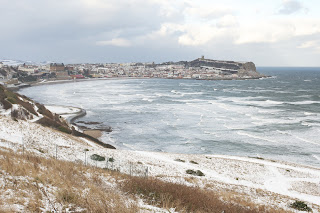 |
| South Bay in Winter |
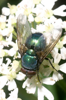 |
| Greenbottle |
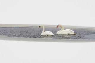 |
| Mute Swans |
The next three are darker than normal, showing the stars, moon and sun. Only the moon shot was deliberately under-exposed to maintain the "atmosphere".
 |
| Milky Way |
 |
| Moon over South Bay |
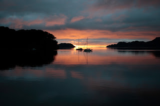 |
| Shieldaig |
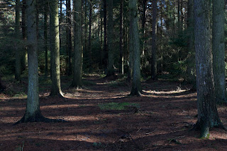
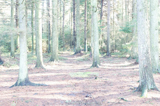
The forest images were actually shot with one stop difference between them because of the wide tonal range of the scene. The darkest one best reflects the mood of the scene, but even that is still lighter than the scene appears to the eye, and 2.5 stops underexposure would have been better.
 |
| Forest -2ev |
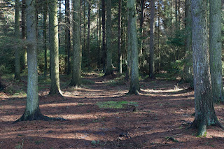 |
| Forest -1ev |
 |
| Forest 0ev |
 |
| Forest +1ev |
 |
| Forest +2ev |
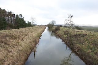
The river Hartford shots are probably all acceptable, depending on what you wish to emphasise, be it sky, river or grass. The minus 0.5ev shot works best for me as it conveys some mood to the shot without it being too dark.
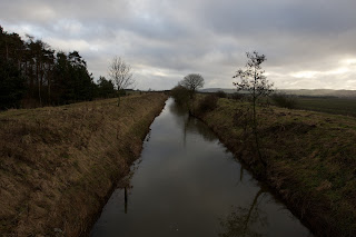 |
| River Hartford -1ev |
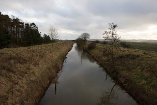 |
| River Hartford -0.5ev |
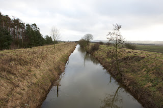 |
| River Hartford 0ev |
 |
| River Hartford +0.5ev |
|
| River Hartford +1ev |
This scene of the North Bay has a very wide tonal range, with reflections from the beach, direct sun, and dark shadows in the foreground. Any of the exposures works.
 |
| North Bay -1ev |
 |
| North Bay -0.5ev |
 |
| North Bay 0ev |
 |
| North Bay +0.5ev |
 |
| North Bay +1ev |
Snowdrops should appear white with a little detail present. The normal exposure has worked best, although one would expect a little over-exposure might be better. The cameras meter has coped well.
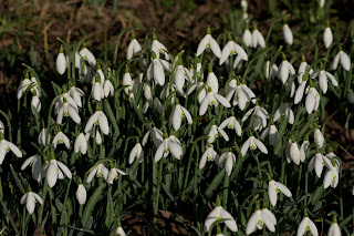 |
| Snowdrops -1ev |
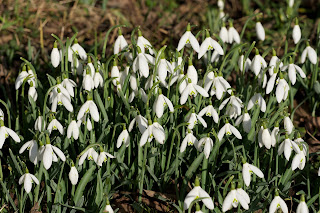 |
| Snowdrops -0.5ev |
 |
| Snowdrops 0ev |
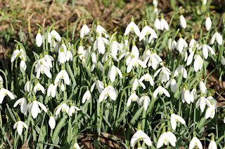 |
| Snowdrops +0.5ev |
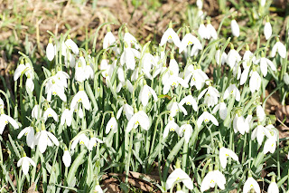 |
| Snowdrops +1ev |
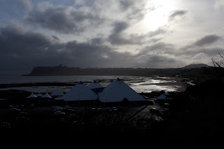
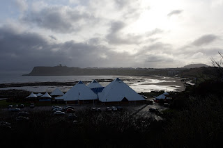
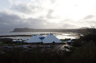
The South Bay images were taken on a cloudy day, so the under-exposed images work best.
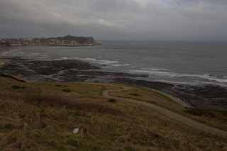 |
| South Bay -1ev |
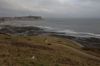 |
| South Bay -0.5ev |
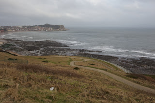 |
| South Bay 0ev |
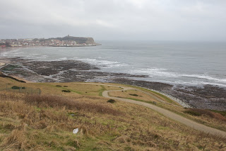 |
| South Bay +0.5ev |
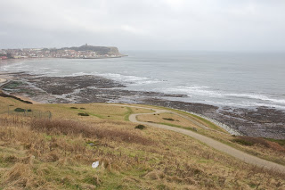 |
| South Bay +1ev |
Again, this scene shows a wide tonal range. Any of the exposures work.
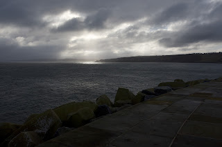 |
| Towards Filey -2ev |
 |
| Towards Filey -0.5ev |
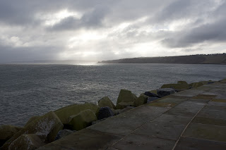 |
| Towards Filey 0ev |
 |
| Towards Filey +0.5ev |
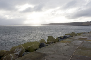 |
| Towards Filey +1ev |
In conclusion, it can be difficult to predict in advance which exposure is "correct", and for some instances, they all are. It's worth bracketing exposures to experiment, when circumstances allow. Not a hope with birds in flight, though.